Blog

Tutorial With JK


Today i had my tutorial with JK, which i believe went really well! got some really good feedback, inputs and suggestions for the final show, which made things clearer and kind of i know where i am moving towards now!

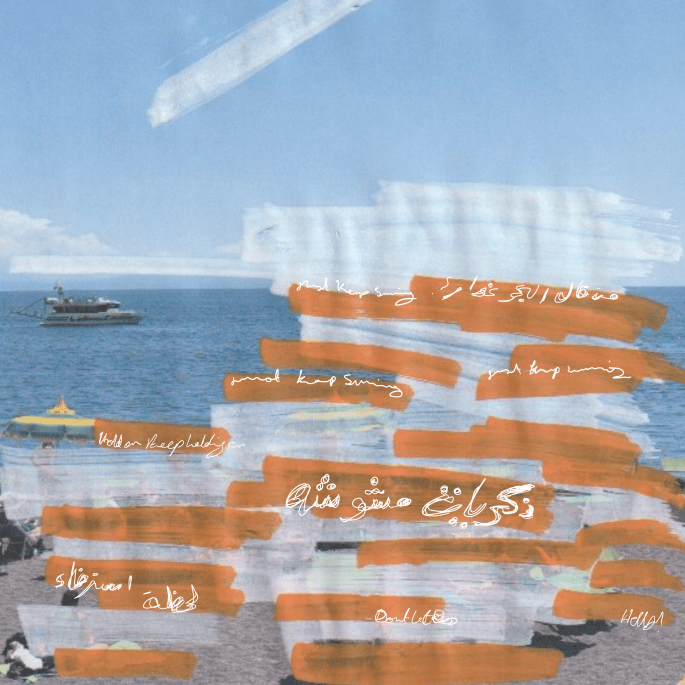
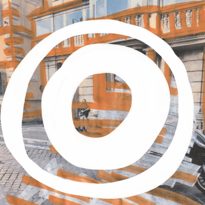
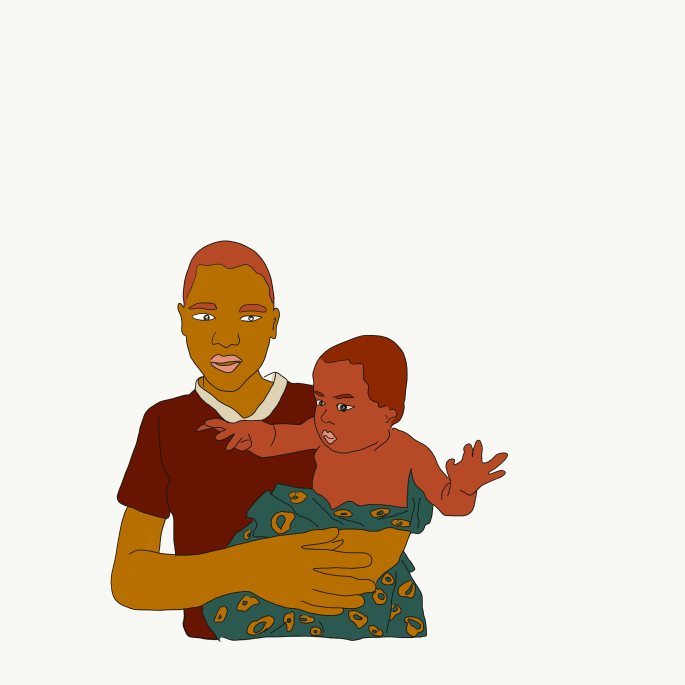
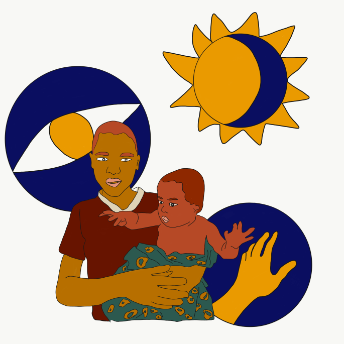
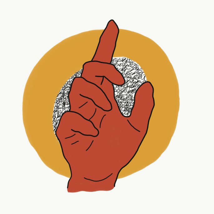
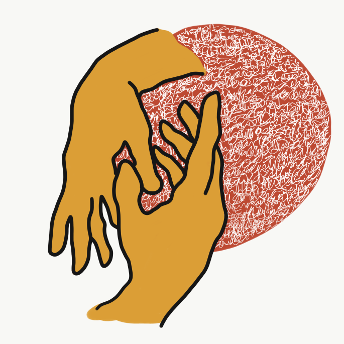
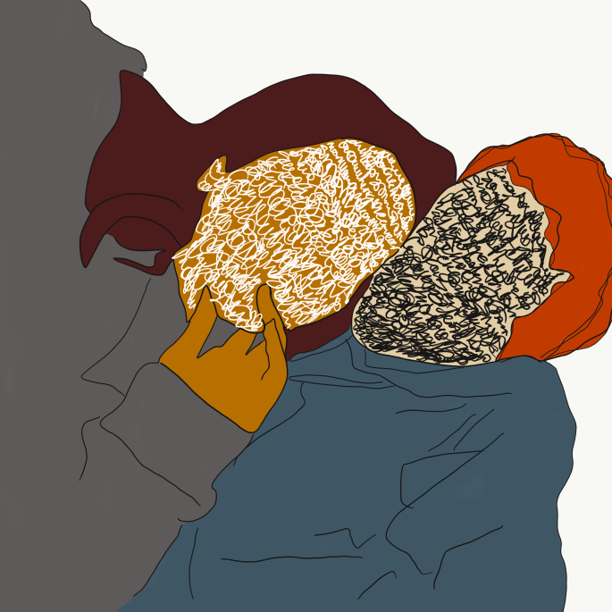
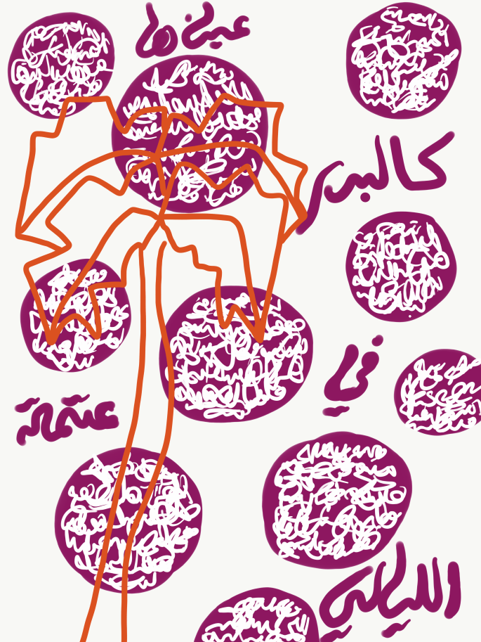
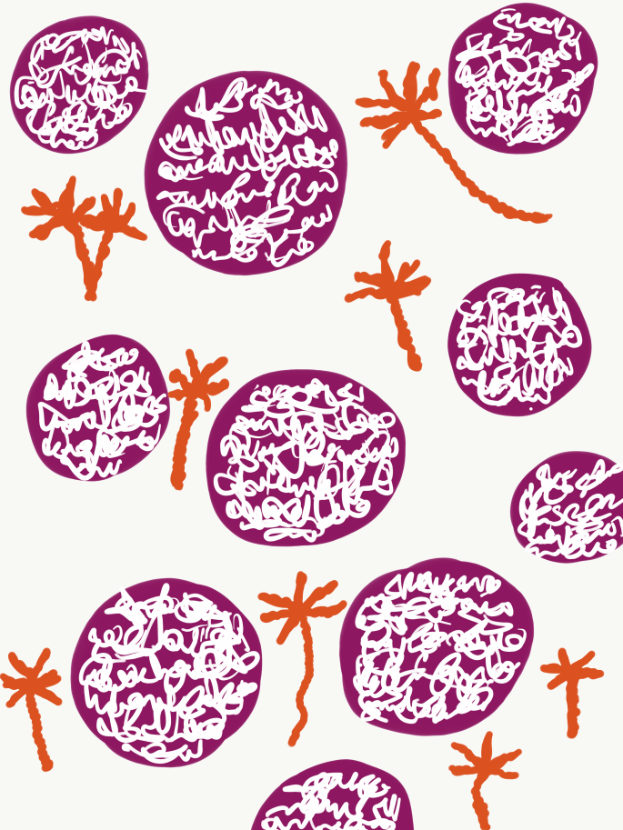
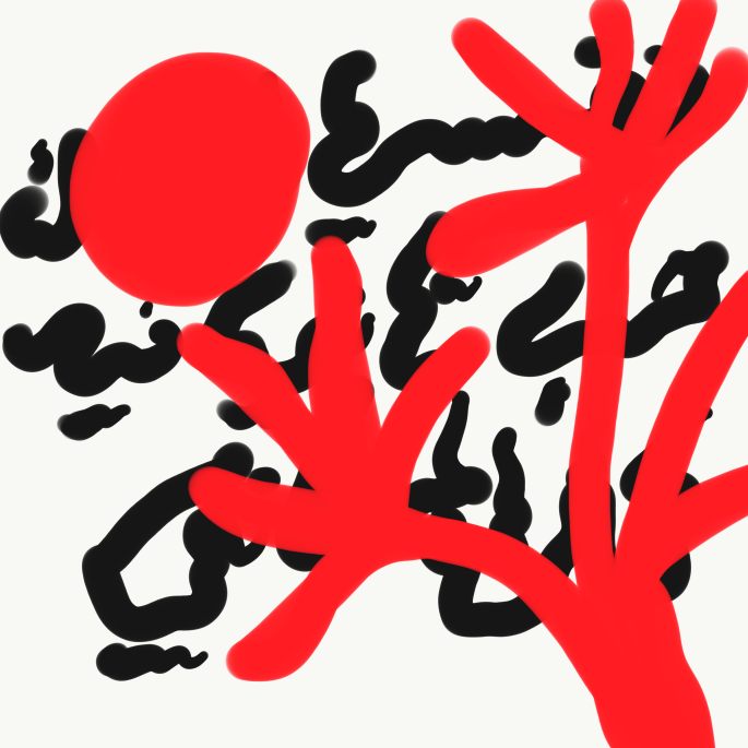
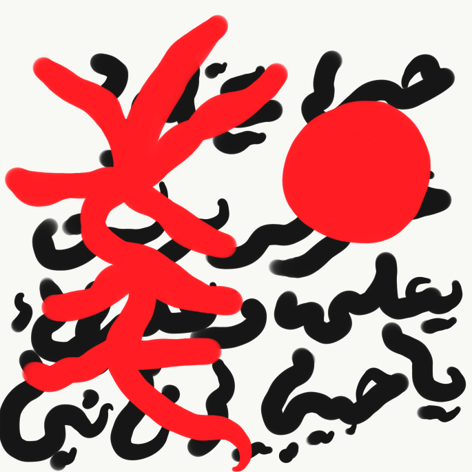
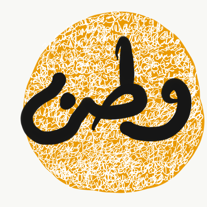
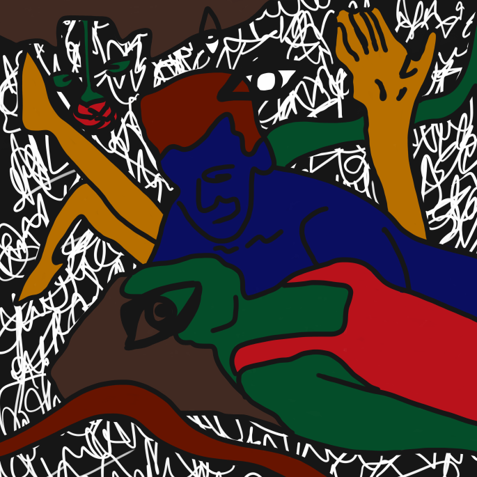
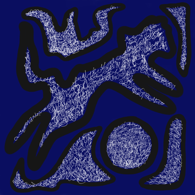
JK liked my video experiments which i really enjoyed doing and encouraged me to create more and consider to include it in my final show project.. i always wanted to create something with movement and step away from the printed work only.. i guess now i have a lot of experiments to do and alot of new videos to enjoy creating!

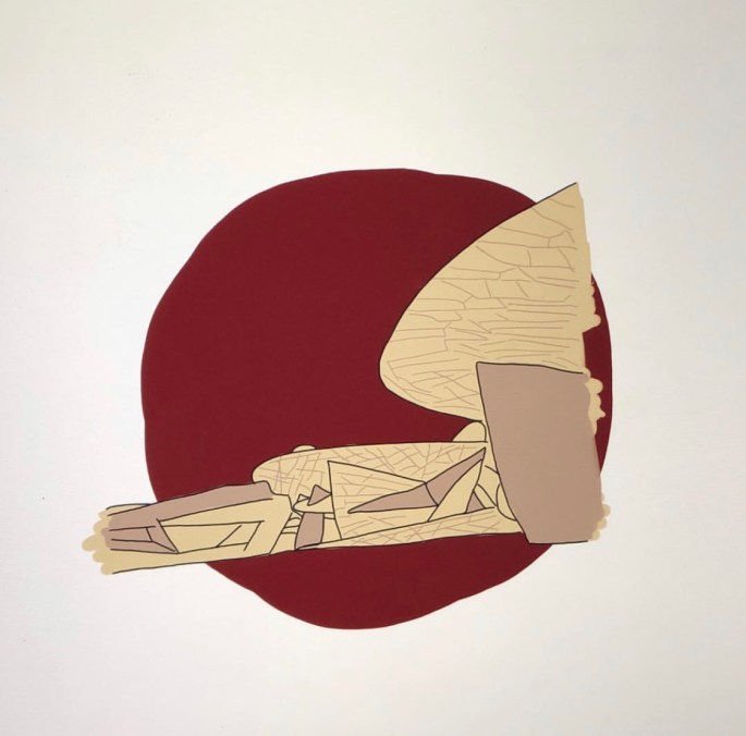
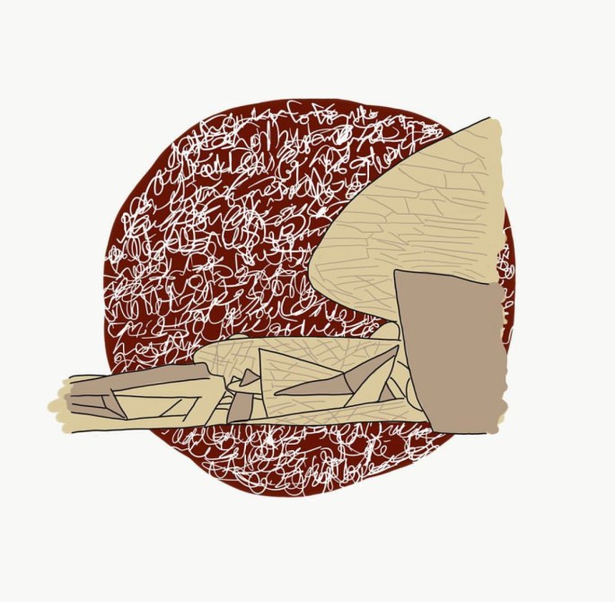
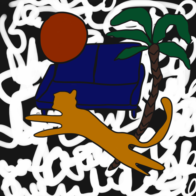
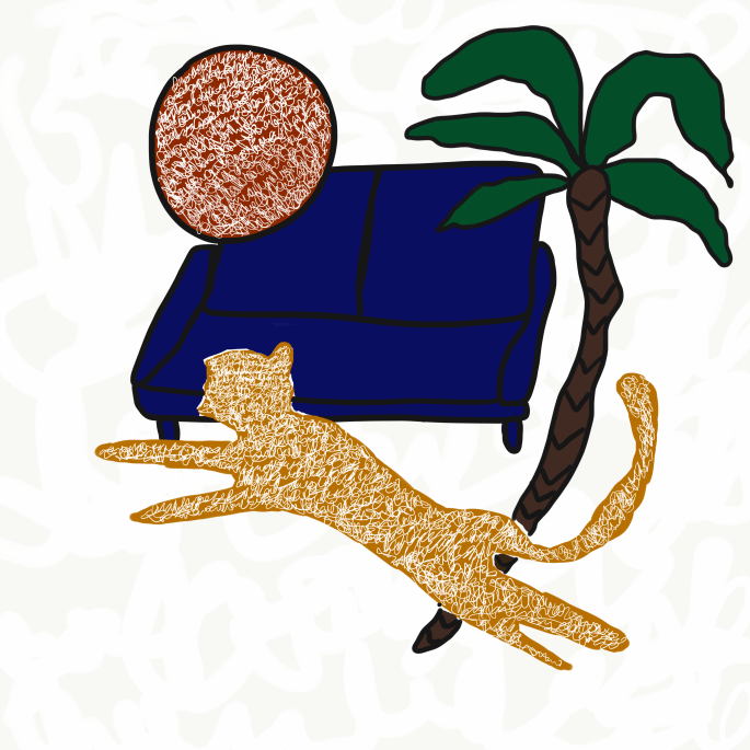
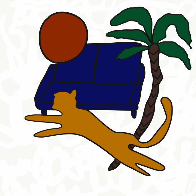
After discussing with JK how the final show project might look like “he helped by sharing the following sketches below” it was easier for me to write down my requirements in the wiki page which i will share here as well. I am glad that JK ideas were a continuation to what i had in mind which made me feel that finally i can say i am moving toward the right direction with my work.

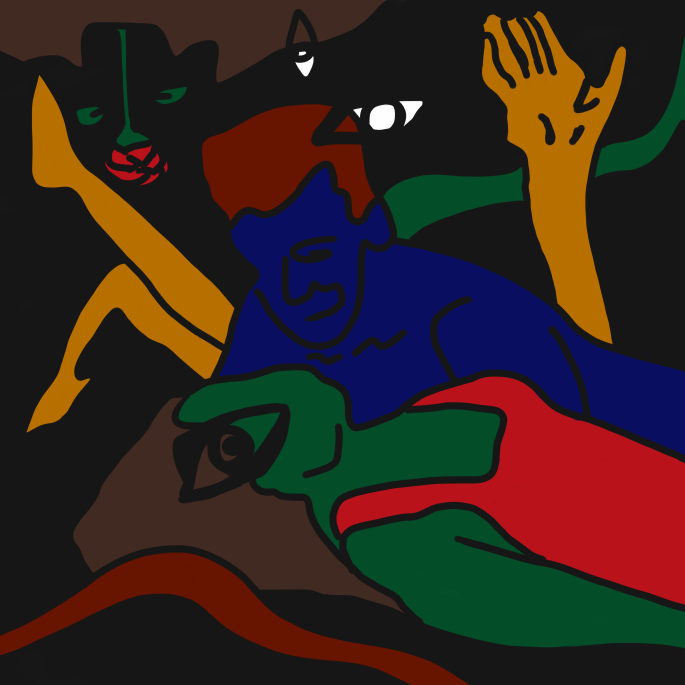
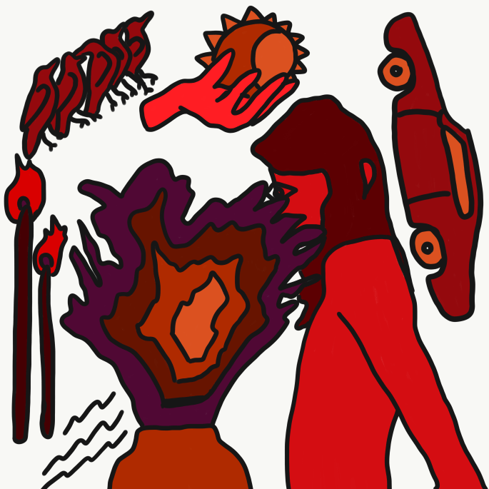
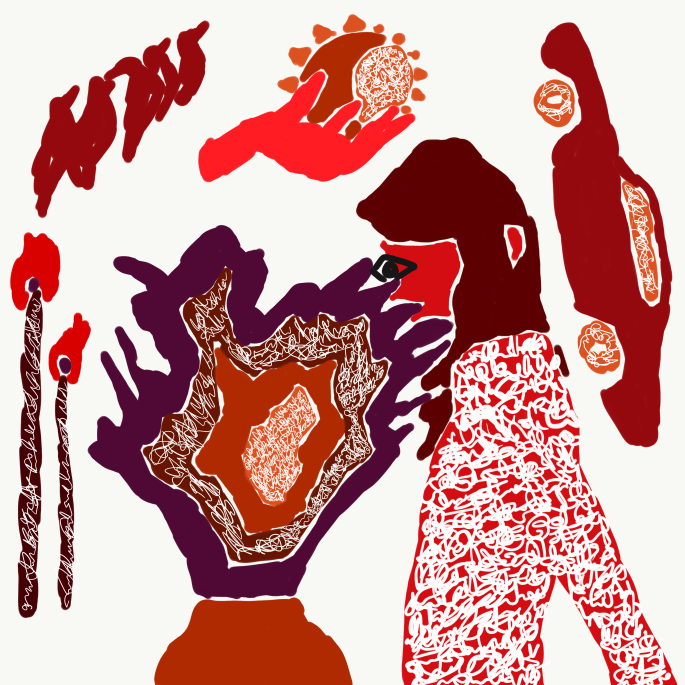
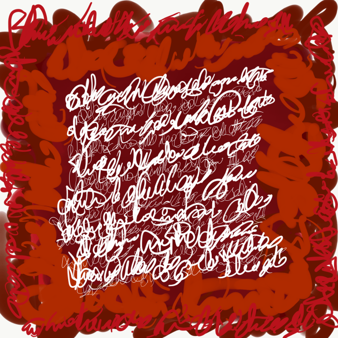
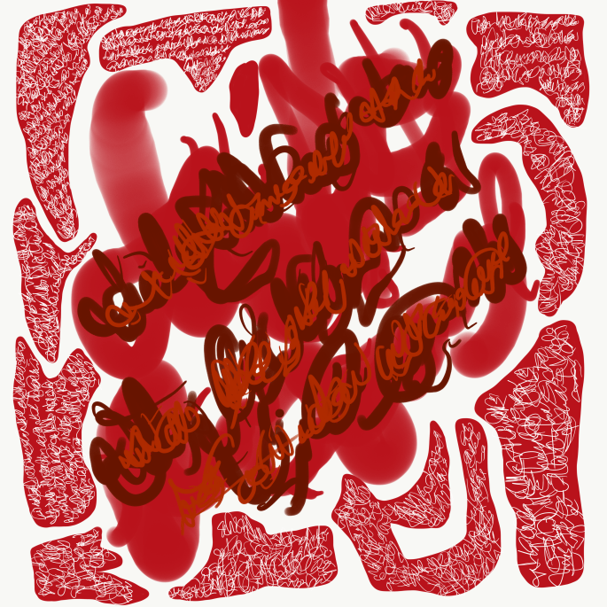
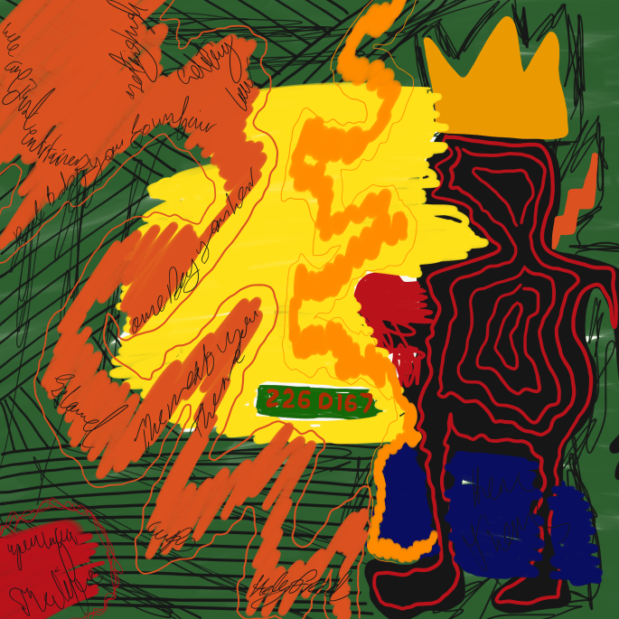
As i mentioned to JK i dont look to my art work as a separate single frame work by itself rather i look at it as a form of integrated emotions that are reflected in many different forms.. and by the idea of having simple A3 and A4 digital prints of most of my work and mount them all together on one wall i feel that represents more of what i am trying to share with everyone. where every single piece of work represents a small fraction of the whole and the whole is just a reflection of the human pattern of thoughts, emotions, observations and judgment.

Final Show Requirements:

wall space to mount on different layers of A4 & A3 prints not less than 20/30 prints can do more even up to 100 or 200 (to be decided during the installation according to the space avilable) those prints will be printed at the printing services available at the library.Projector and maybe a stand for it to be projected on the wall on top of the printed art works. The projector will be used to project multiple colorful short videos were a dark room would be preferred yet with some dim light where the prints can be visible as well.


I will be sharing soon number of different artists previous works that I have been researching for a while, which I can say similar feels to what I am aiming to achieve but with a different take to it.

Video Experiment

I always wanted to experiment with videos where I can implement the same estatics I use in my images. These two videos are the first attempt to do so.

in the first video I combined a slow motion video I took with an image of my and my friend and added text over it. the colorful filter that give kind of a glitch effect and multi layering the work is to another dimension to it.

in the second video it was a video I took where I repeated it on the wide screen then played with the editing layers and colors.


Experimenting With Mixed Media

I pulled out of my own trips archive these photos that have been taken during a trip to Italy. This time I wanted to try it in a different way. I printed the pictures then draw over it using acrylic pens, scanned it again and added the text and circles digitally. This attempt is to add more depth and a different dimension to the work itself.

I am thinking to do another try on the same process, but where I can paint over the image with acrylic more than once to give it more dimension.

Scan 6IMG_0625Scan 7IMG_0629IMG_0628

A Mix Of Both

in an attempt to take JK comments further in mixing the photograph with the illustration I created the following art works.


Here we can see the newly opened Qatar National Museum

IMG_5337IMG_5336IMG_5338


Here is a photo that I have taken during one of my trips to Africa

IMG_0605IMG_0606IMG_0608


Personally I have enjoyed working on both art works, I felt that there something new and an interesting element that have been added to the work as a whole. Another thing that I like here is that I am back to working on photos that I have taken myself away from using archived found images on the internet .

what I am questioning now is either should I keep creating more works with the same characteristics? the triple style image of the process does it add or take away from the work itself? how would the viewer feel about it?


Continues Experimentation

In my last tutorial with JK before the break, I shared with him my latest work that I posted earlier as well as the below works. in the below works I continued experimenting on illustrating over photographs. This time I choose the subject of hands and its symbolism of connection, hope, and love. I later combined it with the moon and my journaling text over it.

IMG_0584IMG_0583 3IMG_0586

JK recommendation was is for me to keep experimenting on the same technique but to try to keep some of the original photo details with lower opacity. He recommended as well to try to mix hand written journals on papers with the illustration.

Here I tried to implment JK feedback, didn’t try to add written scanned text yet. but you can see the original image with low obesity.

IMG_0594

I like the depth this layering is adding to the work and how we can still get a feel of the real photograph, but I do believe there is still a window for me to do it in a better way which I will keep experminting on which might give the work more sense of originatly and artistic feel.

Here you can see some other works I have done in the usual way without showing any parts of the original photo.

IMG_0598 2IMG_0599

More Thoughts More Motifs

My relationship with palm trees have been another story,,, it takes me back to my childhood and to my adulthood as well,, it relates to my home land Qatar as well as were my soul is longing to be in LA. its indescribable how palm trees brings so much joy and hope in me its like me reaching out to the skies each and every time I look at it. The moon is another motif that I love to reference all the time either directly or indirectly of the form of a circle.. the moon for me represents continuous circle of love where we give and take, loose and gain all in one smooth circle.

here I kept journaling but this time my words are readable and if the viewer can read arabic he would understand what I am saying while if they don’t they can’t relate to the words written and its meaning and it would be more of an extinction to my previous work of non readable journaling thoughts ..

I am still trying to see which way I am more going towards, text that can be read and has meaning or more of the shape of the words where no one would know what emotions went in the art work but me.

IMG_0555IMG_0556IMG_0557 2IMG_0558IMG_0559IMG_0560IMG_0561IMG_0573IMG_0574IMG_0575


Inner Thoughts & Personal Motifs

As a continuation to my previous work “maze of thoughts”, I wanted to give the work more dimensions than text as well I wanted to make it related to my original style where I love to mix photography with digital drawings and text.

Here I kept experimenting on writing my daily journal as a form of text in my art work instead of keeping it in my notebook morning pages. however this time I added the illustrations of some elements that I can call them my personal motifs such as palm trees, moon, sun, hands & animals. those motifs are random images that I come across online and I like to archive, and here I illustrated on top of them but with my style where I don’t like straight clean lines as I feel for me it takes away the feelings I carry while creating the art work itself. My color palette is bold and fiery somehow…

I usually like to save the art work in different phases where I feel the variations makes the work somehow more interesting.

I still consider this type of work needs more depth where it can distinguish my style as an artist.


IMG_0519IMG_0518IMG_0517IMG_0516IMG_0515IMG_0514IMG_0520IMG_0521IMG_0522IMG_0523IMG_0524IMG_0525IMG_0526IMG_0528IMG_0530IMG_0531IMG_0532IMG_0533IMG_0532 2IMG_0537IMG_0538IMG_0539IMG_0545IMG_0546IMG_0547IMG_0548

Emotional Maze

For the past few months I have been creating some more digital art.. I had a lot of inner thoughts, feelings, emotions that I found myself not being able to express or understand myself.. in these art works It was purely journaling my inner thoughts digitally in a way that when I revisit those thoughts I can’t read them myself.. but somehow I managed to get it out of my system.. the colors I used were bold colors like red and green which represented my impulsive emotions at the time and the black was that dark cloud which was hanging around me for the longest time..

the technique is so simple and I feel its so not developed yet but I can say it was a form of therapy at that point.

IMG_0511IMG_0512IMG_0513IMG_0510IMG_0509IMG_0508

RESEARCH PAPER DISCUSSION PRESENTATION

Finally I am posting my research paper discussion presentation, that I wasn’t able to have on class on time due to the fact that my laptop crashed and I lost all my work on it! But here I am now adding the presentation to my blog and I really hope that anyone one of you who have a free time would go through it and participate in a better late than never discussion 🙂

I would like to get your point of few on the following question:

1- How do you feel when you see Kruger’s work? Do you consider yourself looking at art or and advertisment?

2- How would you feel if the text over an image is written in a language that you can’t read, would you still look at it as a text or would it feel like an abstract painting over an image?

3- Describe the feelings Richter’s over painted photographs gives you in three words only.

Jean-Michel Basquiat

In my last visit to Paris last November i was lucky enough to visit Louis Vuitton Foundation and see the work of Jean-Michel Basquiat. The exhibition covered his entire career from 1980-1988 focusing on 120 works.

Jean-Michel Basquiat was an influential African-American artist who rose to success during the 1980s. Basquiat’s paintings are largely responsible for elevating graffiti artists into the realm of the New York gallery scene., his spray-painted crowns and scribbled words, referenced everything from his Haitian and Puerto Rican heritage, to political issues, pop-culture icons, and Biblical verse. The gestural marks and expressive nature of his work not only aligned him with the street art of Keith Haring and Kenny Scharf, but also the Neo-Expressionists Julian Schnabel and David Salle. “If you wanna talk about influence, man, then you’ve got to realize that influence is not influence,” he said of his process. “It’s simply someone’s idea going through my new mind.” Born on December 22, 1960 in Brooklyn, NY, Basquiat never finished high school but developed an appreciation for art as a youth, from his many visits to the Brooklyn Museum of Art with his mother. His early work consisted of spray painting buildings and trains in downtown New York alongside his friend Al Diaz. The artist’s tag was the now infamous pseudonym SAMO. After quickly rising to fame in the early 1980s, Basquiat was befriended by many celebrities and artists, including Andy Warhol, with whom he made several collaborative works. At only 27, his troubles with fame and drug addiction led to his tragic death from an overdose on August 12, 1988 in New York, NY.

img_7466img_7474img_7471img_7483img_7500

My Take on Basquiat

After the visit I really got inspired and wanted to experiment new ways of incorporating some of my family old images into a new medium of digital work that is full of colors, text and abstract shapes.

FullSizeRender 7
Figure 1
IMG_0504
Figure 2

Figure 1 is a picture of our archive where you can see my mom and me having a priceless moment of joy back in 1982 in London streets. I took this picture and started drawing over it with bold colors and abstracted lines and shapes inspired by Basquiat work, and added a final touch of some of my journaling texts between the shapes where I was experiencing very personal and emotional feelings as I always do in my normal morning journals pages but this time I decided to include it in my art work.

In figure 3, 4 and 5 below I followed the same technique.

IMG_7255
Figure 3
IMG_0505
Figure 4
IMG_0507
Figure 5