Today I had the chance to show my recent art work experiments during the group critique class. With my busy schedule lately and not getting the chance to work on my project proposal yet this session and the questions I got are really helpful at this point, it will help me in exploring my options and ideas for my proposal in the coming days.
I was the last to go in the class and therefore I didn’t get the chance to answer/reply to all questions/comments I got, therefore i will go through it here in this post.
@Janet asked me the following: “how would it be if the photographic element were receded absented and the caligraphic remaining on its own?”
I actually never thought of this approach before, since I have always been fascinated by the beauty of the human subject and their movement, reactions and the surronding environment in a particular picture. However this is a great idea that I would like to give a try and share with you in my blog soon!
@Steph “Gerhard Richter collated series of personal photographs doing series of these overpaintings. You should have a look I will give the link. I feel the personal has more significance rather than the “borrowed”. The personal for me gives more connection. Also do you consider what you are highlighting and selecting within each image?
I just checked the series you mentioned, really amazing! I will have a special post on the blog about it soon! Thank you for sharing!
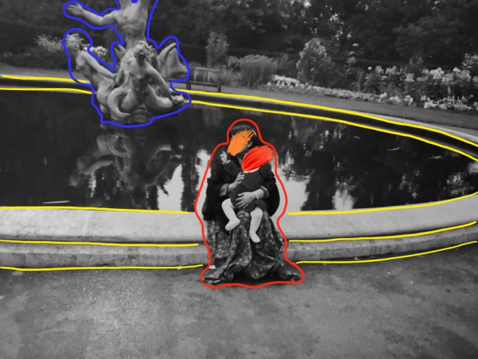
When it comes to the choice of photos I totally agree that the personal ones carry a deeper massage and have a greater connection that can be bridged easily between the artist and the audience! however I always had this thing for photos that are available to all and shared through different media channels, where by working on it I get the chance to speak globally to the audience and narrate my own vision, thoughts about it in order to create a new dialogue over it.
@Ben “Anfal – there is a fashion designer called Sandhya Garg who you might like. She was on Project Runway a few years ago. She makes fabric prints using derogatory words for women in her own language, but they’re really pretty and interesting :)”
Thanks Ben, I checked her work which I really loved, those are my fav!

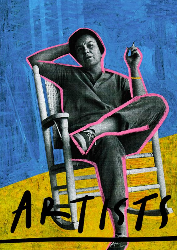
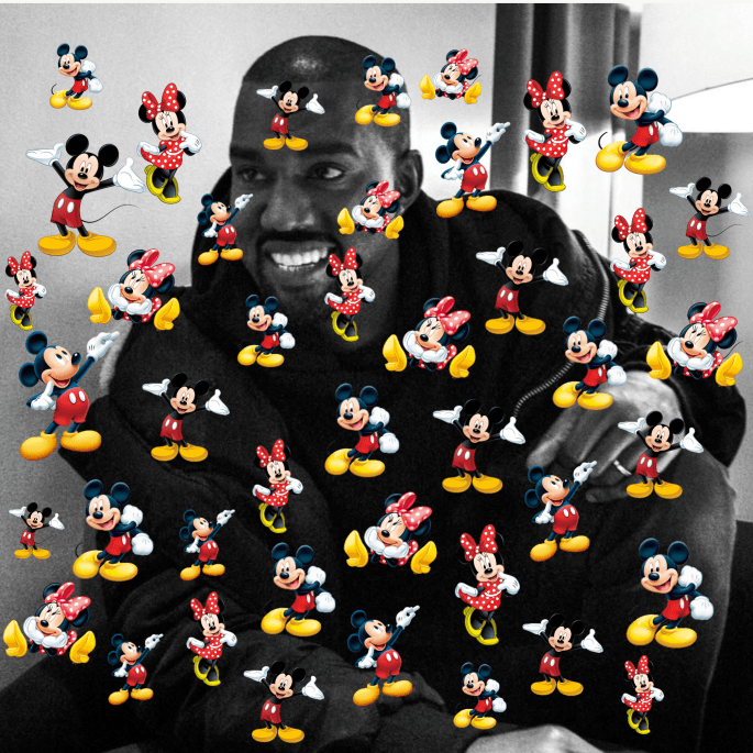
Talent comes in all sizes, shapes, and color

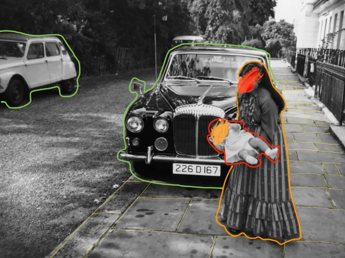
I love some more

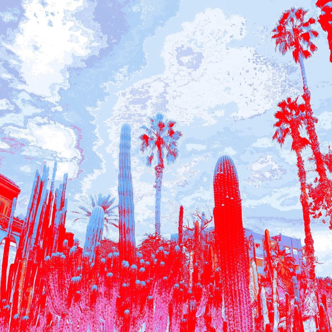
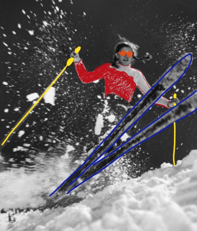
Color Bomb Explosion
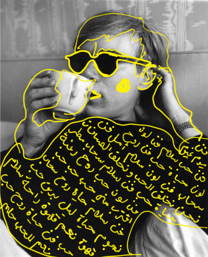
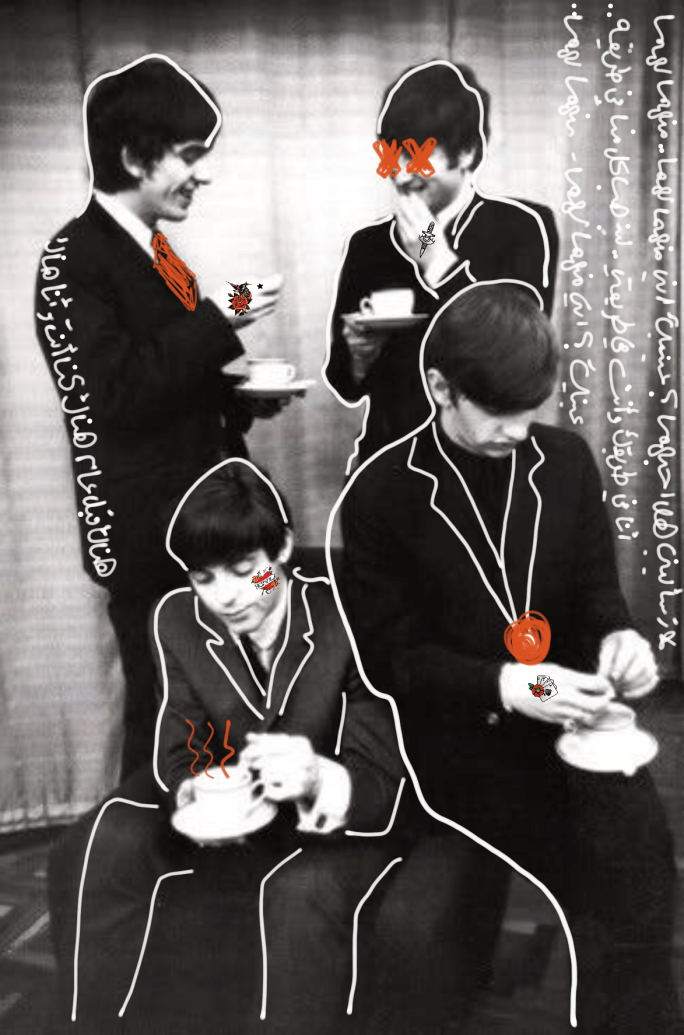
@Steph: “For me in graphic communication, this is normally done for the purpose to gain the attention of the audience to certain products/aspects. Is there an intention in this itself highlighting and captivating certain areas of interest?”
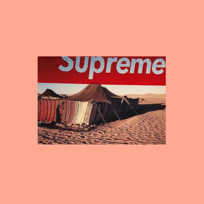
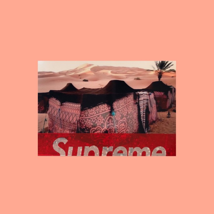
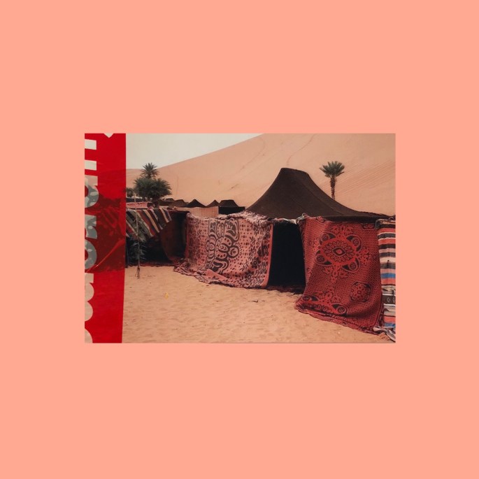
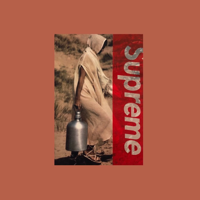
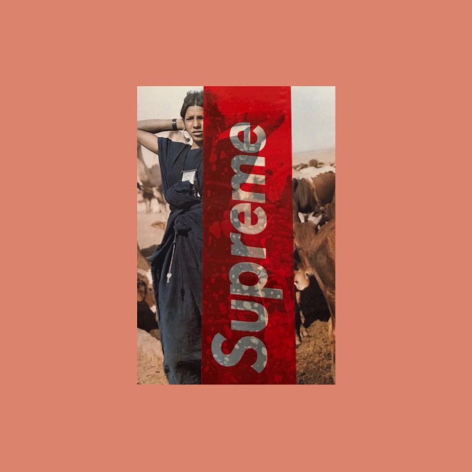
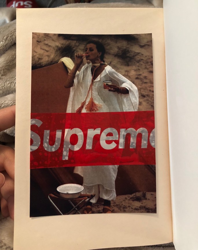
intersting question Steph. As I mentioned before I have to fashion labels, one of them is modest Qatari clothing label and the other one is casual street wear. in my second brand I focus so much on the graphics and massages I use on the products to attract my customers, where most of the times I use words that are part of their everyday life etc.
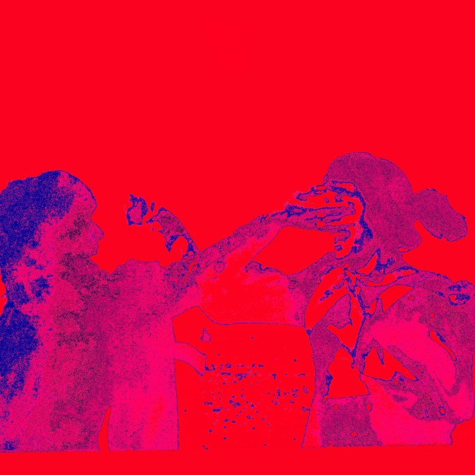
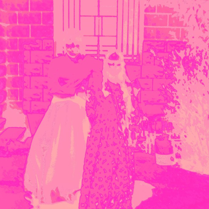
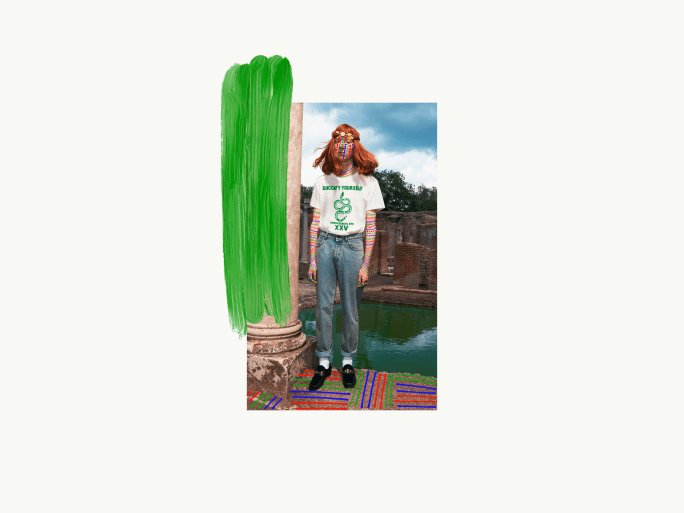
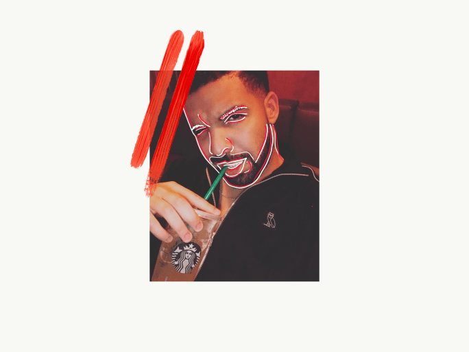
In general I have special love for colors, shapes and words, and through my designs I love to share the visual beauty of it with my audience by creating fun, interesting graphic designs integrated in still photos that can create curiosity to know more in depth about whats the story behind it. you can see that clearly in the pictures I use from my family archive photos where I travel back in time to certain places, memories and moments.
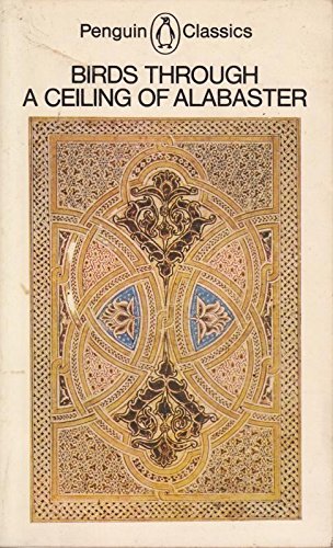
@Janet: “I have an anthology of ancient arabic verse called Birds through a Ceiling of Alabaster – just for the title alone it is beautiful.”
The book cover itself is so pretty! you got me curious to order it and read through it! thanks!
@Jonathan: “ok — it might be helpful for you to experiment with both and keep them slightly separate as you explore?”
Yes, and this is part of the current challenge am facing now. Since both can carry different idea, concept vision and the need to determine will help me to form my project proposal for now.
@Steph: “check out joe cruz Anfal”
I love Steph how you get the direction am going through always! actually I am a big fan of Joe Cruz! His art always inspires me!
@Steph: “Nacho Ormaechea, this artist is awesome to Anfal”
This is like the first time I come across his work Steph! thank you so much for sharing! to be honest his work now inspired me a lot to try some ideas related to Qatar!
Finally i would like to say that this class was really inspiring and helpful! I am so excited to try more new things and share more posts on the blog!